A Printmaker's Guide to Buying at Print Fairs
INTRO
With the first print fairs of the year coming up here in West Yorkshire, with both Sunny Bank Mills and The Hepworth Wakefield, I thought this might be a nice topic for my first ever blog…who knows it might also be my last we’ll just see how it goes.
I’ve been selling my screen prints since 2012, and exhibiting at fairs for about that long, I’d like to think I’ve picked up some things over the years. So first off this is purely my opinion as there is no right or wrong in art, it’s all subjective, this is just a little guide and a bit about what you can consider when purchasing prints.
You might prefer to match your curtains, that happens more than you’d think! I once got told someone was matching their curtains to one of my prints and I think that is a much better way round!
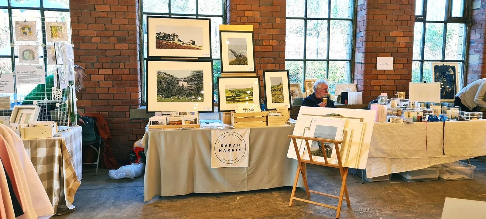
The images I’ve included come from our collection of prints at home.

Wood engraving by Leeds artist Jonathan Ashworth. We actually went to the same school and he also taught me to print at an evening Leeds College. Jonthan’s work is stunning and I love this beautiful little print.
THE GUIDE
I have a lot of love for print fairs but there can be a lot of noise, you can have a lot of artists talking to you (if you want to engage) about a lot of different techniques, papers, frames, sizes and each will have their own take and opinion so it can be a lot to take in. I’m going to look at a few things that you might come across whilst at a print fair that you might want to think about on your visit.
Let’s start with the basics…
First rule of buying a print - buy what you like!
Hopefully you’ll even love it. There can be a lot of overwhelm at print fairs, but don’t be swayed it’s your purchase, it’s going on your wall and you’re the one who will enjoy it for years to come.
If you haven’t already you will find the style that suits you and subject matter, be it landscapes, still life, gig posters, text or abstracts. Personally being a bit of a luddite, I am a screen printer which itself is a pretty archaic method (Drew Milward called it that and it stuck with me). I find that I’m immediately drawn to handmade processes, something that has longevity and interest and ideally sparking a memory, or just something that amuses me. Again it’s down to personal preferences, you can just buy something that you like, there doesn’t have to be a reason.

Barmier II by Leeds based artist Cath Brooke, is a drypoint and mono print, with a very small edition of 4.
Buying the first thing you see
I always like to have a look around and make a considered purchase, see what sticks with you. With big print fairs I do think it’s worth seeing everyone who’s there first, especially if you’re working to a budget.
If you spot something it’s worth asking the artist if it’s the only one they have before you walk away, it’s likely they will have multiples but not always. If you know it’s the last in an edition you do run the risk of it not being there when you get back, or the next person might grab it, especially if they’ve seen you looking at something! So in those cases don’t spend too long thinking about it as that one piece may well sell before you’ve made up your mind.
Is it an Original?
From a “traditional” printmaking technique (more on that later) then yes it should be a handmade original as these are created by using processes and exist solely in that form (unless reproduced digitally) but there are always exceptions to the rule…and as you’ll see from the reading these always seem to involve screen printing!
In Havana in Cuba I remember stumbling across Taller de Serigrafia screen printing studio, I popped in and they showed me screen print reproductions of paintings with 40 plus layers, it blew my mind but I’ll definitely be sticking to single figures when it comes to colours. You can also get screen print reproductions of linocuts and other techniques.
Digital prints sometimes also only exist in that form so they can also be classed as an original, but are not hand printed. You can hand print a digital image and that’s where screen print often comes in.

Risograph by Black Lodge Press, uneditioned. Big fans of this artist and their distinctive style.
Does process matter?
Not at all, I think the more you visit these events you do get drawn to certain styles and processes. In my own collection obviously I love screen prints, having an appreciation for the method, but I like to collect a range or work, as you can see from the included artworks here. However I am drawn to linework…which should come as no big surprise.
Gaining an understanding for an artist’s process might give you an appreciation for the time and effort that’s gone into producing it. Artists will often bring plates and props to show you so don’t be afraid to ask.
Certain techniques take longer or will only allow for a few prints, maybe only one, and therefore should be more expensive than un-editioned prints for example and these are factors that will be reflected in pricing.

Kes I by Lisa Stubbs, screen print. I had to hunt this print down after seeing it in Huddersfield Train Station once and as there were only 12 printed, I was very lucky to get this one! Fun fact kestrels are my favourite bird and I studied A Kestrel for a Knave at GSCE.
What methods are there?
So there is Traditional Printmaking, these methods are usually very physical and often involves multiple steps, it’s that labour of love for that printmaker which is not always easily understood by visitors to events who have never tried it.
If you’re interested in finding out more print fairs are a great chance to meet the artist and have you mind blown by the amount of work that takes place. Have you ever heard of a Mezzotint? I still can’t get my head round the complexity that’s involved in making one of those! Here’s a quick rundown of some processes you might come across. You can find some more detailed information here.
Intaglio - These printmaking methods are where the ink is held in the indentations in a printing plate. This includes the following methods, drypoint, etching, engraving and mezzotint.

Etching by Leeds based Janis Goodman - Cacti in the Orangery, an edition of 50. Love Janis’s work and this is beautiful, I think the dramatic mount really adds to it too. Framed by Art Works in Otley.
Relief - These methods where the print is taking from the raised surface and the bits you don’t want to print are taken away from the printing plate. This includes linocut, woodcut and letterpress.
Planographic - This is printing is taken off a flat surface and can include lithography and screen print
Monoprint and Monotype - There can only be one print taken from these methods, these can sit under various printmaking methods but each print is treated in a unique way which can not be exactly replicated.
Collagraph - These prints involve creating a plate using various materials like a collage, to create texture. It can be used both as intaglio or relief.

Ian Burke - Hummer, woodblock print, edition of 10. Huge fan of Ian’s work and we have a couple more, they remind us of our visits to Staithes.
You also have Digital Printing which can include reproductions of peoples drawings, paintings, prints as well as something drawn on the computer. I recently went Salts Mill to see the David Hockney’s new exhibition of iPad drawings of flowers, he mentioned how his work is still hand drawn just using a digital output, there’s even a great video showing his process.
Digital Prints – They can be called various names such as art prints or poster prints but they’re all the same thing (I think) and are printed by a digital printer.
Giclee prints – A fine art method of reproducing using a specialised high resolution printer for a higher level of quality and are usually fairly expensive, mostly used for reproducing paintings and photographs.
Risograph - is a little different as the colour layering process is very similar to screen print as colours are layered but using a certain type of photocopier.

Aird Mhot, Barra by Ron Lawson - Giclee, edition 195. This is probably our only Giclee, and you can see it’s a good quality reproduction of the artwork which was originally a painting. Bought at Manchester Art Fair.
Do all print fairs include digital work?
Over the years there has been a greater amount of artists selling digital pieces at print fairs so not everything at a print event sits under what you consider the traditional printmaking umbrella, it’s opened up to more of a way of reproducing art in a more general way. Saying that some fairs you won’t find any digital work as there are very much about the traditional printmaking methods, such as Printfest, but in general events are a lot more open to digital art, 3d printing and outsourcing production. This can which allow for a more “affordable” way to purchase from a maker, but that’s not to say they’re always cheaper than handmade prints.
Apart from digital prints will everything else be hand printed by the artist?
Simply put…no, and that’s not just the digital prints. The majority of traditional printmakers will produce their work from start to finish, however in letterpress and screen print you can get some examples of mechanisation.
Why is a Screen Print artist saying their work is hand pulled rather than handmade?
The term handmade is becoming more blurry, I recently spoke to someone in the industry and there seems to be a rise in saying hand printed on an image that maybe only has one element that is actually hand printed. Someone might say hand pulled to highlight that physical process they do, it’s hard work.
Not everyone uses it though, I actually don’t have it on my work but I might consider it the future.

Clare Caulfield, Saltaire screen print, artist proof. This was one of my first artwork purchases well before I started screen printed and I’d forgotten about it, but I love it and it was bought at one of my favourite events, Saltaire Arts Trail.
What other ways can a Screen Print be made?
So first of all the method to create the stencil on a screen can be by either cutting it out and sticking it on the screen, painting directly on the mesh using a screen block or using the photographic method using a light sensitive emulsion and a UV light. You can also create monoprints!
For the actual printing itself it gets even more a complex, so here’s a little run down…
Manual – this will involve hands, pulled by hands on a squeegee or hands on a printing arm that holds the squeegee. This can be very simple done using clamps on a board and you can get a lovely handmade feel with some movement. I use a much more substantial bit of kit, a manual vacuum print bed, which helps with accuracy. Obviously I am a sucker for a hand pulled print, there can me more inconsistency but that’s the lovely thing about a hand printed piece.
Semi-Automatic Machine – requiring a similar amount of work to manual (possibly even more), with a more accurate set up process, the difference is on the print bed the pull of squeegee is mechanised and happens by the push of a button. This is used for larger editions as it’s such a physically demanding process and it allows for more accuracy and consistency. For reference these are sometimes called hand printed, sometimes not… I wouldn’t like to call it either way.

Art by Drew Milward (another Yorkshire favourite), Leeds Beer Festival 2015, screen printed by Prints of Thieves, edition of 100. I don’t buy too many poster prints unless it’s for an event, and we love Drew’s work so we have several in the house.
Fully Automatic Process – There are some very fancy set ups out there! I’ve not one seen myself but I do follow some workshops on social media in that there London, involving computers, conveyer belts and dryers. These are used for volume, accuracy and can make artists prints amongst more commercial products. For example Make-Ready have an amazing set up.
Also you have Outsourcing – Instead of being printed by the artist some printers just produce work for other people, or in addition to their own work, this is usually screen print, lithography and digital print. in screen using any of the above machinery. Some digital artist use this as an output for their work but don’t want to do the printing themselves. I did this for some of my Northern Monk Patron’s Project prints and got the amazing Leeds based Prints of Thieves to do it, but I stated who printed the work when selling the prints as this was a rare occasion and I wanted to be transparent about it.
So does any of this matter…I think at the end of the day it’s the visual you’re drawn to and the reason behind why you would buy something. If you’re interested in knowing how an artist works and it’s a deal breaker for you, and as I say language can be confusing, a print fair is the ideal time to ask in person. You can sometimes see by looking at the artist’s social media too.

Artwork by Melvyn Evans - Celtic Figure, screen printed by The Print Block as part of a series during lockdown, edition of 14. It looks like this would have started as a linocut.
What is an Edition?
It’s the amount of prints that were made of that design, if it’s a limited edition there will be what looks like a fraction at the bottom of the print usually found on the bottom left. The bottom number indicates how many there will be of that image, and the top is the number of that print. Sometimes other versions or sizes will also be made and that will be a different edition. If there is no numbers then it will be an open edition with no restriction on the quantity made.
Personally I usually buy limited edition print, it’s not that conscious of a decision, but it’s nice to know not everyone will have the same piece so will usually look for prints with 100 or less in the edition. It wouldn’t stop me buying something I liked though!

Linocut by Sheffield based James Green, edition 25. It took me a while to decide which of James’s prints I wanted but I loved the narrative in this one.
What do these letters mean?
Sometimes instead of a number you might find initialisms. Here’s a rundown of the meaning and these are outside of the editions:
AP or A/P (also EA or PA) – Artist’s Proof, can either by from prints saved by the artist for their personal use but it is sometimes used for these development work Sometimes these are numbered, generally these should not exceed 10% of the edition but that’s not necessarily true.
PP (also PI) – Printers Proof can indicate the outsourcing of the printing process to a Master Printer or Atelier and this would be one of their proofs, for their records or as a gift from the artist.
TP – Trail Proof, made before the final print these can show the creative process.
MP – Monoprint, used instead of 1/1,
MT – Monotype, used instead of 1/1,
VE – Variable Edition is sometimes used for an edition which has one consistent element like drypoint of screen print in conjunction with a variable, such as a monoprint.
EV – Edition Varied, possibly printed with different inks or on different papers.

Artist proof, etching of Ayutthaya (unknown artist), bought on a trip in my favourite place in Thailand Chaing Mai and although I’ve never been to where the print depicts, it very much reminds me of my travels.
Signatures
If it’s a limited edition especially it should be signed to show it’s legitimacy. This will either be on the bottom right of the print or it might come with a Certificate of Authenticity. Some digital images my not be signed, especially if it’s an open edition.
Do you need a Certificate of Authenticity?
I think it depends on the information you give on your print, as edition, date and sign on the front and all my work is screen print I think this is a little redundant but if an artist uses various methods, doesn’t write on the front or make digital reproductions it would certainly be a useful addition, I would expect on a Giclee for example. Not having one usually isn’t a deal breaker for me.
Why is the paper Embossed?
Probably because it looks cool! It gives the print a level of authenticity but no more than a signature or a Certificate of Authenticity.
Framed vs Unframed
Not all frames are equal, and you can’t always go on price to indicate quality, this is reason I will often hand my frames to people considering them, mine are wood and professionally made in Yorkshire so I like customers to know what they are getting…I’m quite particular about this stuff. Look at the price, ask to see one and if you’re the sort of person who never gets round to sorting out a frame than buying a framed option would at least put you a big step nearer getting the artwork on your walls.
You could also ask if the print is a standard size, but personally if I’m investing some money in a print it’s nice to get a frame to suit it and that could be direct from the artist or your local framer. If it’s an investment piece I might consider getting it framed professionally with art glass which helps stop sun damage, but ideally an artwork you buy shouldn’t be hung in direct sunlight…but that’s pretty hard to do and I only own one piece with art glass.
On the other side, if it’s a fairly inexpensive print then I’m happy not to spend too much on a frame be it from the artist (if it suits my style) or a premade one.

Whitby by Yorkshire artist Helen Peyton, Night Sky series, this is a linocut and mono print so is an edition of one. We bought this shorty after our wedding with some money we were given to buy something for our house and fell in love with this at Helen’s exhibition. We bought it framed as it was a one off and we liked how it was done, finished with art glass.
What if my walls are full?
The controversial side of this is actually tastes and styles do change! I was lucky enough to grow up in a home were my parents did sometimes invest in art. They used to visit the long gone Leeds Art Fair at the Corn Exchange, they didn’t buy anything hugely expensive, but I sometimes wonder if they still love the pieces they bought 40 years ago… I am not as keen on something I bought 10 years ago, so I will rotate and retire pieces. One of the things as an artist we’re often told is that the walls at homes are full, that’s fine you can look at an artist’s work and just appreciate it we totally understand, but also why not mix things up at home. Do you still like what’s on your walls?
Plus there’s always room for a small one!

This lovely little etching is by Yorkshire based Moira McTague, part of an edition of 30.
I hope you find this useful, it’s a lot to go on, so take from it what you will. If you’re interested in reading my next blog or seeing any new artwork please sign up to my mailing list here.